
Often the process of designing an user interface for a website is a collaboration between different stakeholders within a client team and agency. In my experience the process tend to become too democratic. There are important UX conventions that need to be complied with when designing a web interface, which can fall prey to democracy. Such conventions should not be up for discussion. So why is that?
When we use a well designed website or interface, we instinctively know where to find each element (e.g. site search, a link to “our Facebook page”, a link to “share on Facebook”, “Contact Us” link, a Buy button, etc.) and understand its meaning. This intuitive facility with the interface is driven by a number of cues: its position, its level of boldness, its design, its color and how it reacts when we tap / click / hover. When you see a Facebook icon at the very top or bottom of a page, you know that’s a “Follow us on Facebook” link. See a Facebook logo next to an article or photo? That would be a “Share on Facebook” icon. Often it’s the same icon, but the position denotes its distinct meaning.
By extension, we interpret the juxtaposition of all the elements together, to gain an understanding of what the whole interface is all about (e.g. corporate website homepage, online ticket purchasing site, blog etc.)
When a UI designer has done their job well, the interface is invisible to us, leaving our minds free to focus on getting value out of the website or app rather than wasting time trying to comprehend the mechanics of the delivery. When using a good design, we don’t need to consciously scan from the top left of each screen to the bottom right, thinking about each element we come across, trying to discern its meaning. It’s like language. It is the Language of Layout. When someone speaks to us in our native language, we don’t need to spend time thinking about the grammar, the word order or the vocabulary — we need only focus on the meaning.
As with any language, you need to use the words and grammar of the users you are talking to in order to make yourself understandable and attractive.
The conventions underlying the Language of Layout in User Interface design have been researched and documented in numerous studies. Still, not everybody internalizes the above argument, which is why you may want to adopt the following Door Handle Metaphor to communicate its logic.
You push DOWN the door handle to open a door. Right? Isn’t it utterly annoying when a handle has been turned upside down? Now you need to push UPWARD. To me, it feels like defying the laws of physics by carrying through this simple task in this unusual way. When the proverbial door handle is put upside down, it is often the “general manager” who have overruled the “specialists” (the architect, the engineer, the experienced builder, etc.) to get through his idea of door handle innovation. But note, it is simply bad design, no matter the power and brilliance of the boss in other spheres of business.
When you are…
· Placing the Press or Careers link anywhere outside the utility navigation
· Using a variety of colors for calls to action on your website
· Placing the shopping cart on the left side of the page
· Making form fields that look like buttons
· Creating funky new icons for things like ‘mail’, ‘delete’ or ‘close’ that bear lttle resemblance to the expected norms.
…then you are speaking a foreign language to your user and definitely not the Language of Layout.
But, like spoken language, the Language of Layout is a living thing. A small number of UX purists still insist that all inline links should be blue with a solid underline. But most sites no longer adhere to this — nowadays a simple change in colour is enough (not necessarily blue). As people learn the Language of Layout, cues can become subtler over time. Another great example of language evolving is the use of the “hamburger menu” on desktop websites. Because of the small screens on mobile devices, main menus needed to be hidden behind “hamburger” menu buttons (those three little lines).
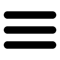
Now that everyone is comfortable with that button — its purpose, design & location — they are starting to be used on desktop websites. What started as a mobile design pattern driven by the physical limitations of mobile displays has evolved into a new piece of vocabulary in the Language of Layout on desktop devices. And that’s OK, because everyone is now fully fluent.
Just like in our everyday language, new words and new grammar emerge. They do so slowly. To be on edge you need to be able to identify trends and integrate these into your User Experience. But if you are not Apple, Google or Alipay you should probably not be the front-runner by trying to create new layout conventions overnight, but rather excel in how you articulate your proposition in the currently accepted Language of Layout.


.png)
